
Coffee shop ideas · 2026
Coffee Shop Design Styles for 2026
Explore four coffee shop interior design styles for 2026, with real café examples and practical menu, counter and tabletop signage ideas.
A memorable cafe is more than a color palette. Materials, light, circulation and the way a menu appears at the counter all shape how a guest experiences the room.
These four coffee shop interior design ideas begin with a real design reference, then show how a small tabletop detail can belong to the space. Start with what guests need to find—today’s menu, a bean story or a local collaboration—and let the room’s materials guide the display.
Natural & Grounded
Warm wood, stone, daylight and objects that feel good to hold.
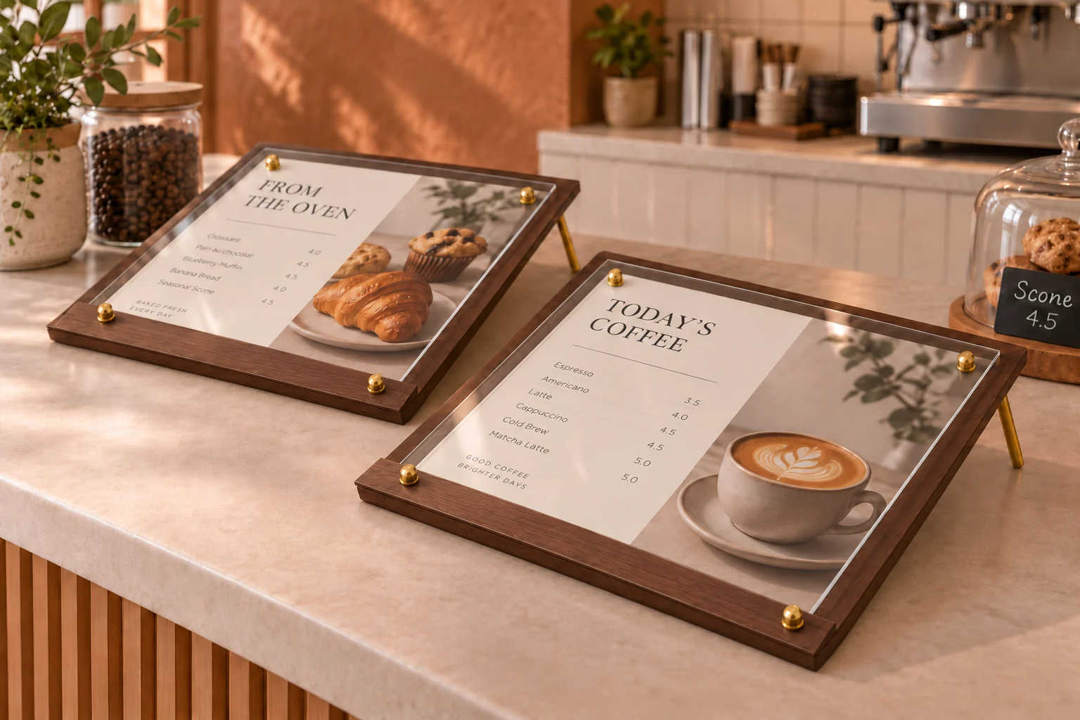
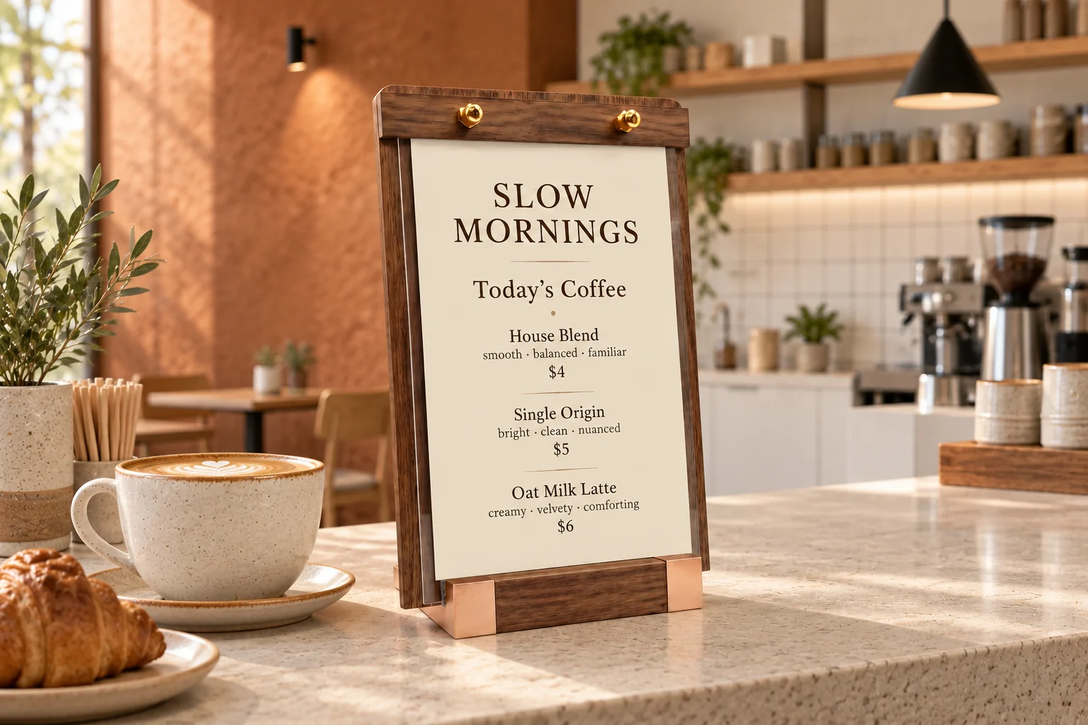
For a cozy coffee shop interior design, warmth can come from wood grain, matte stone and soft light without filling the room with plants. In a compact cafe, those materials can make the ordering counter feel calm even when the service is busy.
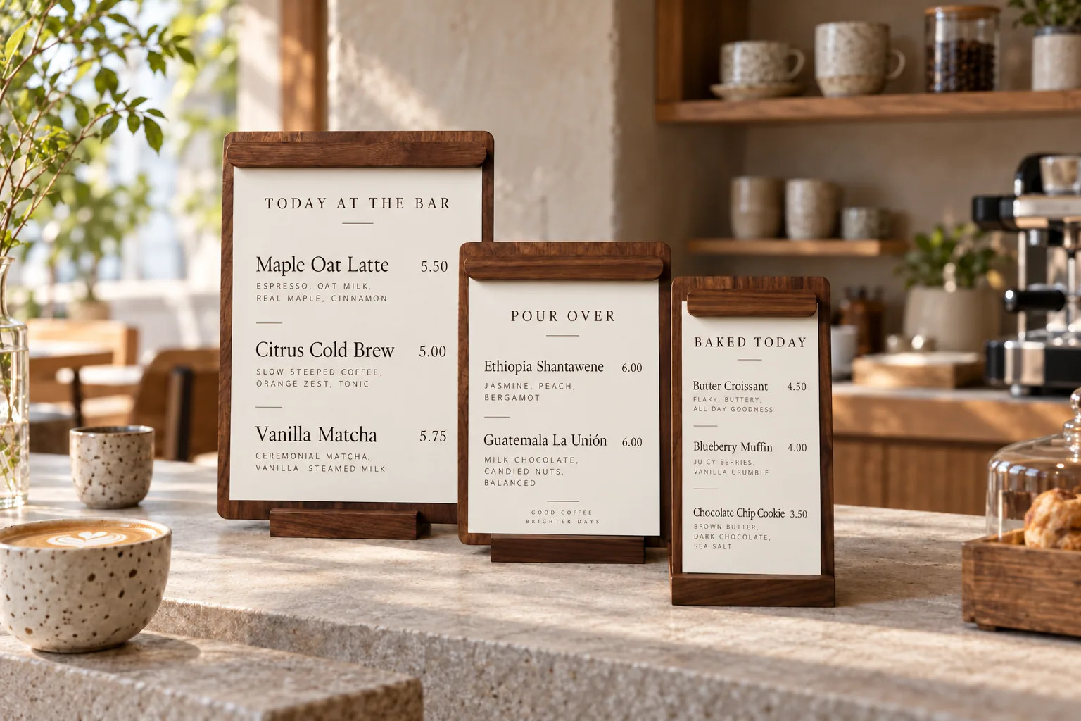
Set a pair of low-angle walnut-color standoff holders at the counter for the day's coffee and baked goods. Their dark backboards, clear fronts and warm-metal details sit quietly against pale stone. For a taller drinks menu, the portrait wooden sign holder carries the same material palette upward.
A deeper wood accent
The dark wood framed signs offer another way to carry a warm material palette across menus, bean notes and pastry cards.
Ask about this series →Refined Industrial
Concrete and steel, made welcoming through light and measured warmth.
Industrial spaces work best when the raw and the precise support each other. At Rumble Coffee, the designers pair concrete blockwork and a stainless steel counter with timber tones. That mix keeps the craft of making coffee visible while giving the room warmth.
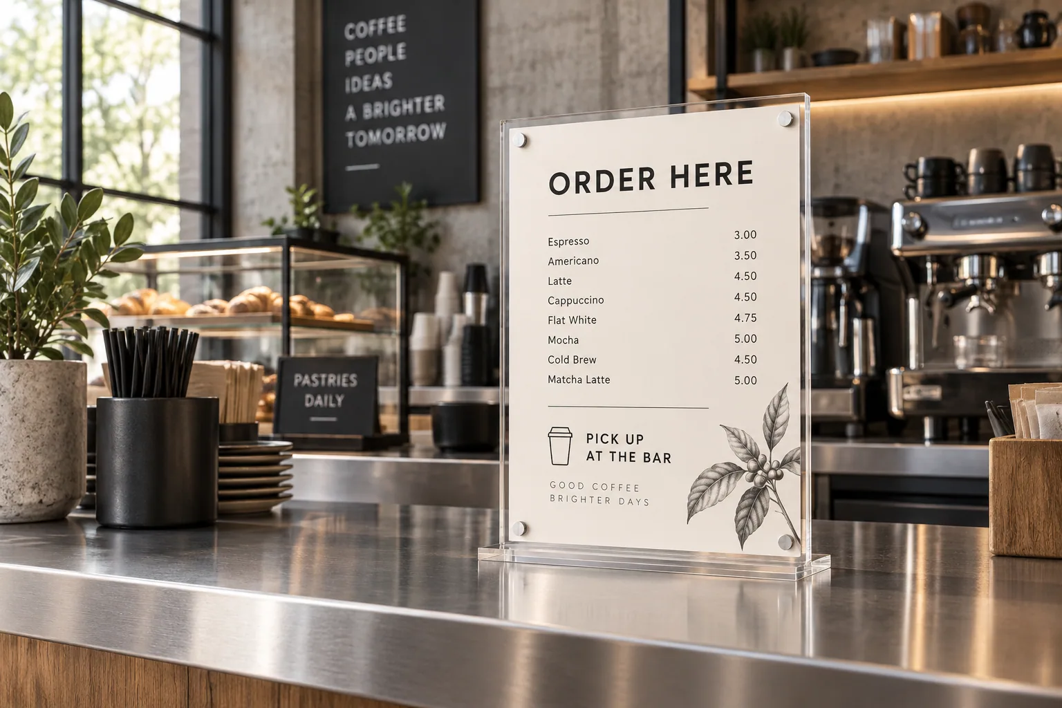
A clear magnetic acrylic sign gives the ordering counter a crisp information point without hiding its steel surface. Its magnetic front lets the printed menu change as the offering changes. Keep the insert direct: a short coffee list, clear prices and one line explaining where to collect an order. For a stronger material echo, the brushed metal tabletop sign shown below is an upcoming option.
Blue Bottle Coffee Legoland in Shanghai offers a more playful counterpoint. Its modular concrete language shows how industrial materials can lead somewhere lighter.
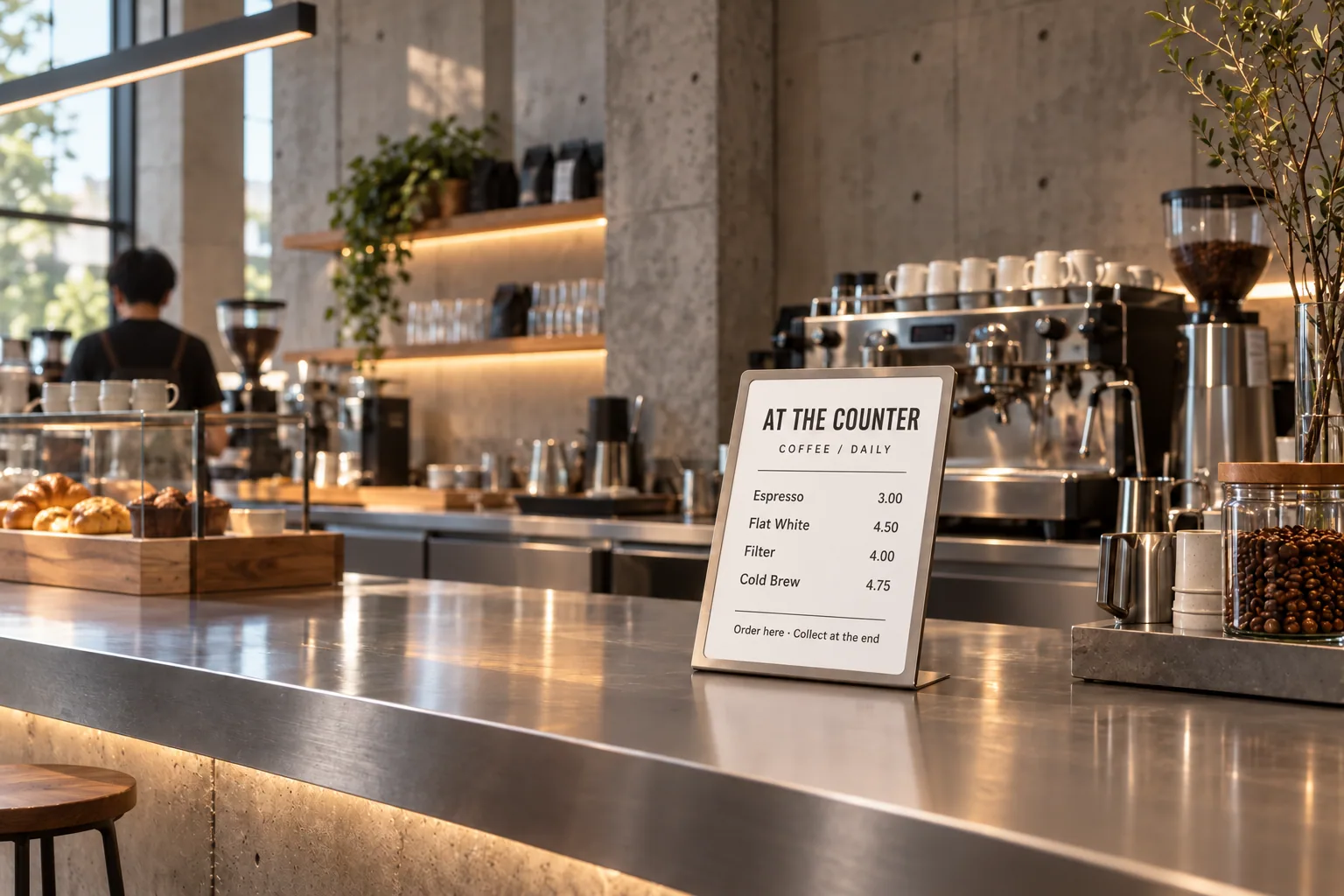
Metal on metal
This brushed metal sign carries the counter’s finish into the menu detail.
Ask about the metal sign →Quiet Wood & Modern Lines
Japanese and Scandinavian-influenced simplicity, without reducing either tradition to a label.
This direction shares natural materials with the first style, but its mood comes from order and restraint: clean joinery, quiet surfaces and space around each object. Galleri Sonja is a useful reference because its cafe, shop and gallery use pale materials and careful detail without making every surface compete for attention.
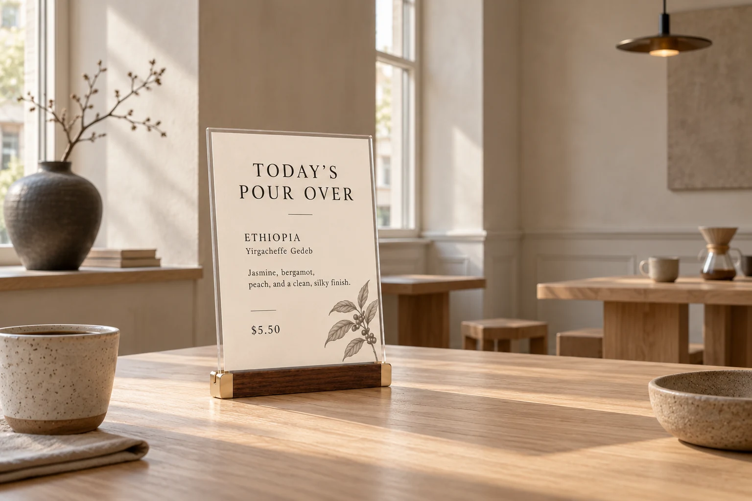
One readable bean story near the pour-over bar is enough. The slim walnut-color base of the L-shaped sign adds a measured dark line to a pale counter, while the acrylic panel keeps the information visually light. Focus the card on origin, process and a few tasting notes. The upcoming pale wood frames below offer a softer all-wood variation.
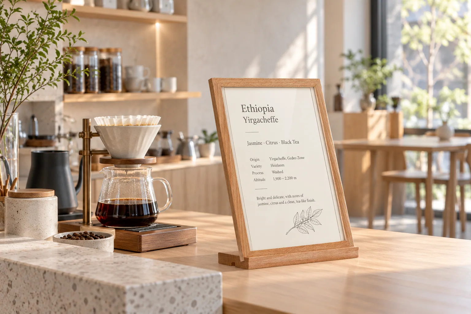
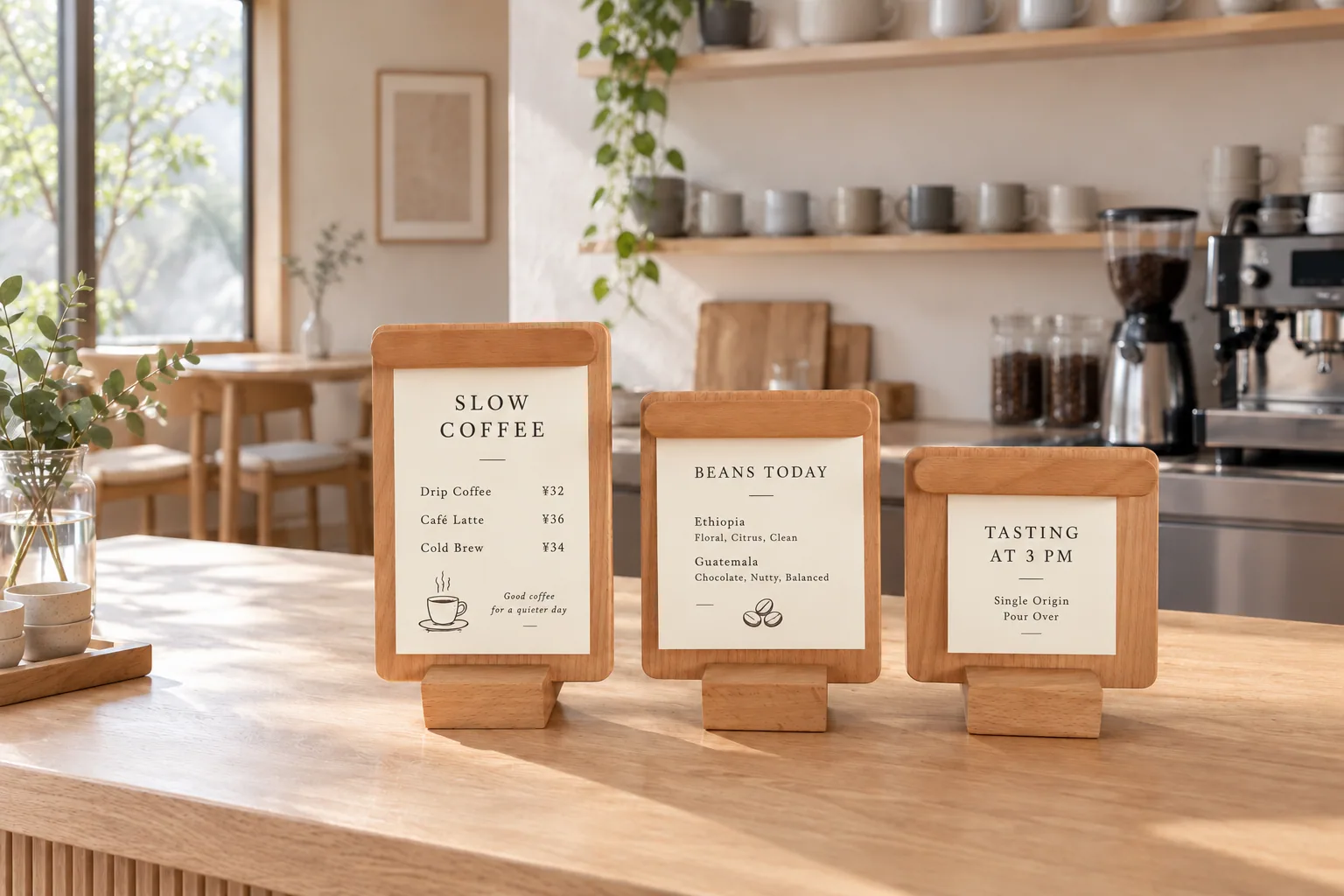
Pale wood frames
An A4 frame for the full bean story, with smaller rounded-top cards for daily notes.
Ask about the wood series →Rooted in Place
A cafe whose character comes from its people, collaborators and surroundings.
Local character cannot be ordered from a catalog. It might come from an old brick wall, a nearby roaster, a neighborhood bakery or the owners’ own story. At Laymoon Café, the designers worked with the owners’ Palestinian-Syrian heritage across the interior, brand and gathering spaces. Coffee shop branding design feels stronger when it grows from a real story; menu typography, printed cards and materials can carry that story through the room.
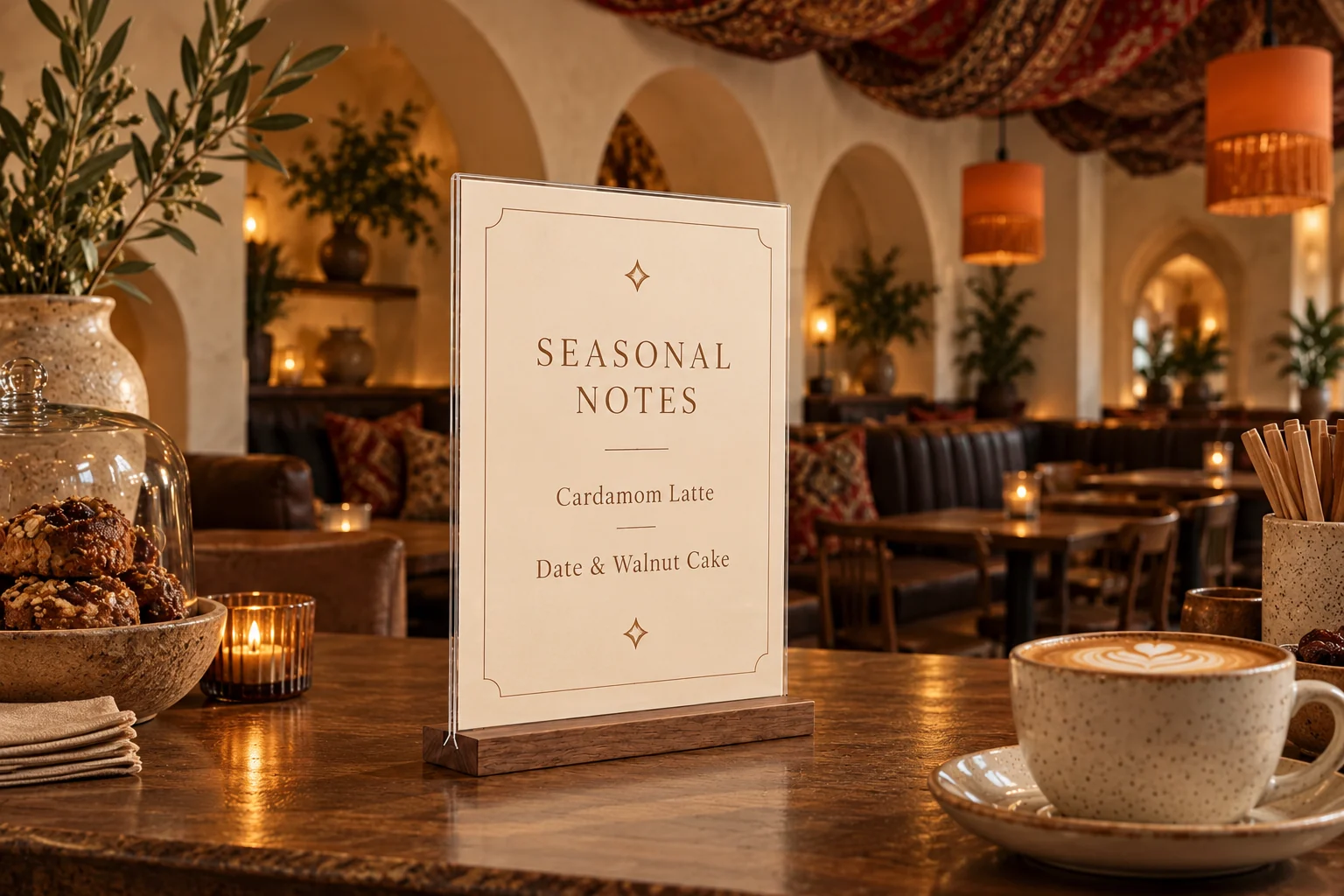
On a bean shelf or bakery counter, an acrylic sign holder with a walnut-color base can introduce a genuine collaborator or explain why a particular coffee is served. Its removable insert leaves room for changing stories. The pale-base version below is an upcoming alternative. For an actual store, names, dates and claims should come from the people involved.
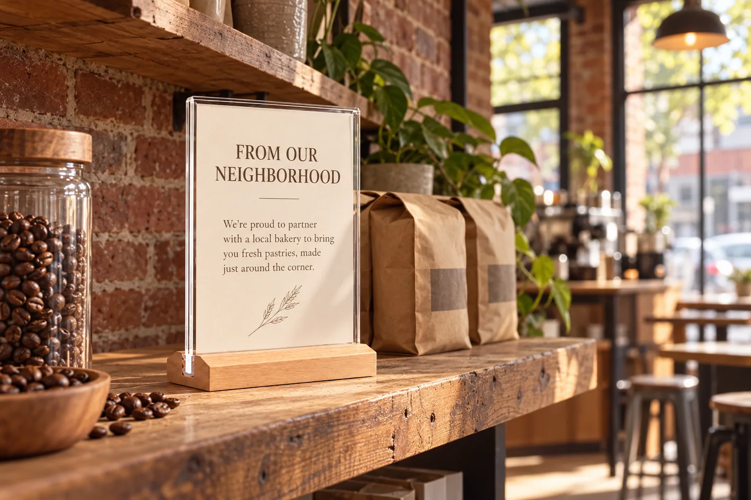
A lighter wood note
The pale base works on a reclaimed shelf or among locally made objects while leaving the story in the insert.
Ask about this style →Beyond Coffee: The Many Roles of a Café
Across these four styles, a common idea emerges: a café is shaped by what people do there, not only by its finishes. A shelf may sell beans or objects; a table may host a tasting, a laptop session or a neighborhood gathering. Koncrete Space is one example of coffee, retail and community uses meeting in a single setting. As the uses multiply, so does the information a guest may want to browse.
Two display formats suit these changing roles. An acrylic flip holder shows the current weekly program on a shared table while keeping other pages ready to browse. A wood-base flip holder carries bean stories, makers and events at a retail shelf. Keep essential prices, ordering and pickup directions visible at the counter.
Design reference
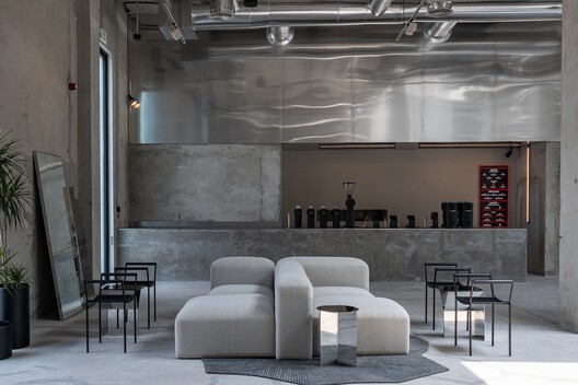 Photo: Bianca Studio / ArchDailyKoncrete SpaceShell + CoreCoffee, retail and community use share one adaptable space.Explore the project ↗
VISUP product scene
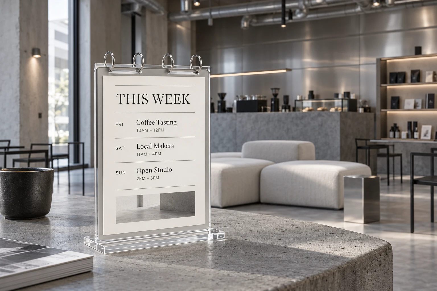
For light shared tables
A clear acrylic base and four-ring format keep the weekly program visible, with more pages ready when guests want to browse.
Explore the acrylic flip sign →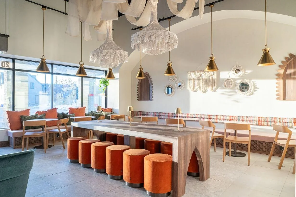
VISUP product scene
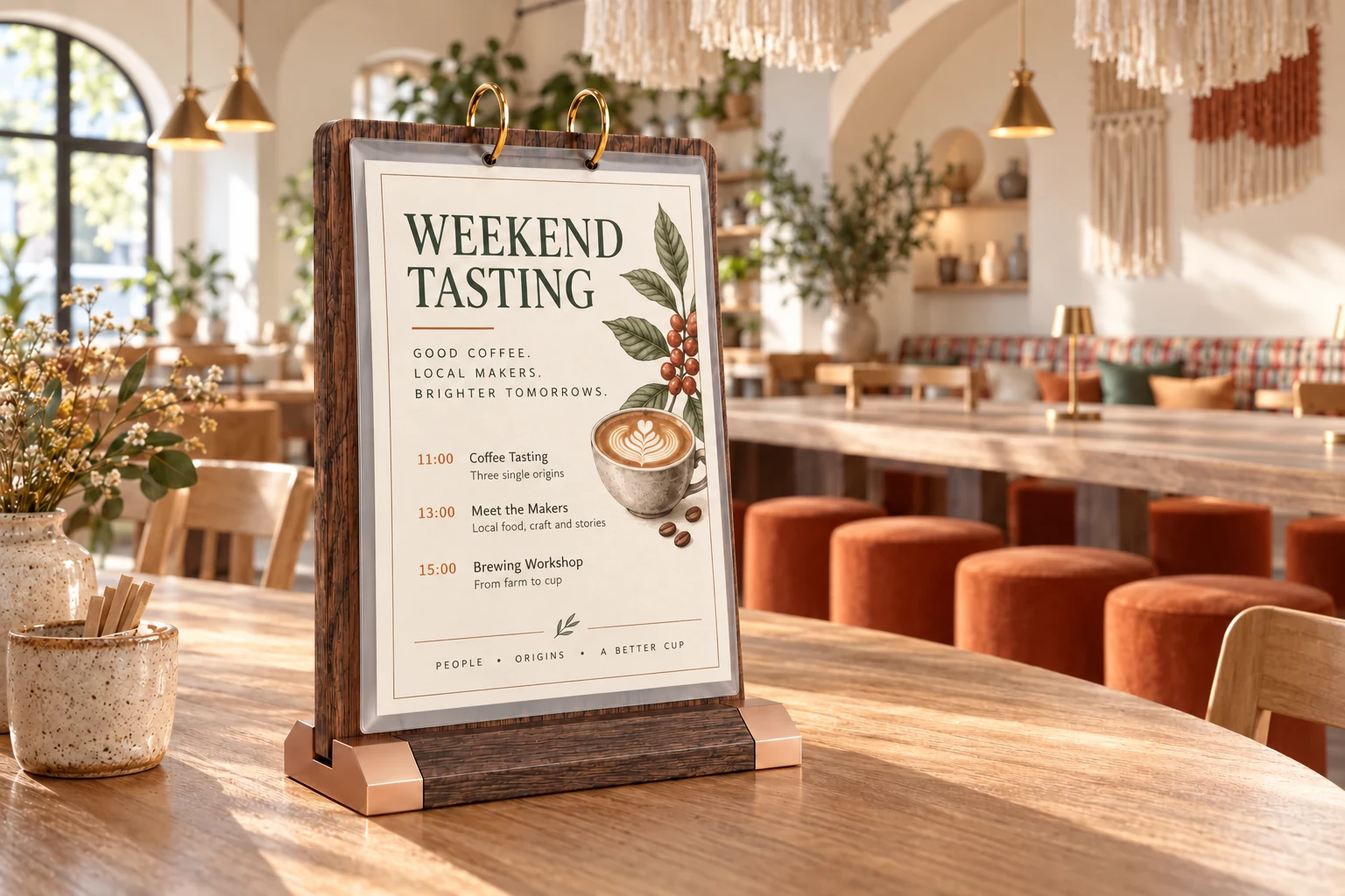
For warm retail counters
The walnut-color MDF base and four clear pages suit bean stories, makers and events.
Explore the wood-base flip sign →About the imagery: the design reference photos are displayed from their original project sites and credited in each card. VISUP's cafe scenes are styled visualizations from product references, with illustrative inserts; they do not depict installations at the independent projects shown here.